This Space Intentionally Left Blank - The Airy Beauty Of Empty Space In My Home
It’s been a little over a year since I purchased my first ‘I-live-here’ home. I’d owned investment houses before, but always resisted the idea of owning my primary residence. Too much work for a young-ish single woman who liked to keep her options open, I thought. And I was right. It’s a lot of work. I half-jokingly say that i married a building. Still, it feels good to have set down root in red clay after floating around Europe on and off for a few years.
After my gypsy period, I had to start absolutely from scratch. I had sold all of my furniture, and only had a few decor and sentimental items tucked away in storage. A blank slate can be both daunting and inspiring, and a test of how creative a frugal diva can be while still expressing her style. My current design includes a mishmash of thrift store finds, budget retail buys, and splurge-y high-end pieces, accented by interesting souvenirs from my travels.
One intentional design element I tried to incorporate was emptiness or negative space. My house is single-person sized and the main living space is open concept with lots of windows. I wanted to make sure that the space still felt light and uncluttered even with big furniture pieces - like a dining table, or chairs in front of the windows - in the main line of sight.
Here are some of the ways I worked in blank space to keep my main living area feeling light and airy, yet still substantial enough to be the center of my home’s daily activity.
Blank Frames in a Picture Gallery
My entry wall is higher than the other walls in my home and leads to a dramatic vaulted ceiling. A perfect place for an eclectic wall gallery of photos and paintings. I originally intended to put smaller photos inside of these frames I found at Goodwill, but thought they looked good blank - more designer-y if you will. A good way to give the eye a rest while taking in the whole collection.
Source: My local Goodwill store
Transparent Louis Chairs
Or, as i like to call them: my Wonder-Woman chairs. The formal Louis style of these chairs make the space feel elegant. The clear acrylic construction lets light shine right through them. Since they’re placed in front of the bay window in my kitchen, I definitely appreciate the fact the it leaves both the incoming light and the outside view completely unobstructed.
Source: Amazon.com
Upcycled Vintage Dining Chairs
These are one of my favorite things in my space. I found these chairs on Craigslist for about $15 each. I’d been looking for some Art-deco style chairs with open backs and felt very lucky to find these for such a low price (everything else I found was just not what I wanted to spend at the time). There was just one problem: they were in terrible shape. Luckily, one of my new neighbors is pretty good at refinishing old furniture, so I gave her my ideas and some fabric remnants I’d purchased in Spain. She painted and reupholstered them for me, and I love how they turned out! The open woodwork on the backs of each chair wasn’t salvageable on all of the chairs, but I think that adds to the quirk and character of them.
Source: Craigslist
Glass Dining Table
I never considered a glass dining table before, but since my table sits dead in the middle of my living space, I knew I didn’t want some big, hulking object taking center stage. This very modern looking table actually pairs well with the vintage-modern dining chairs, and the flat plane of glass almost disappears when you’re looking across the room.
Source: Wayfair.com
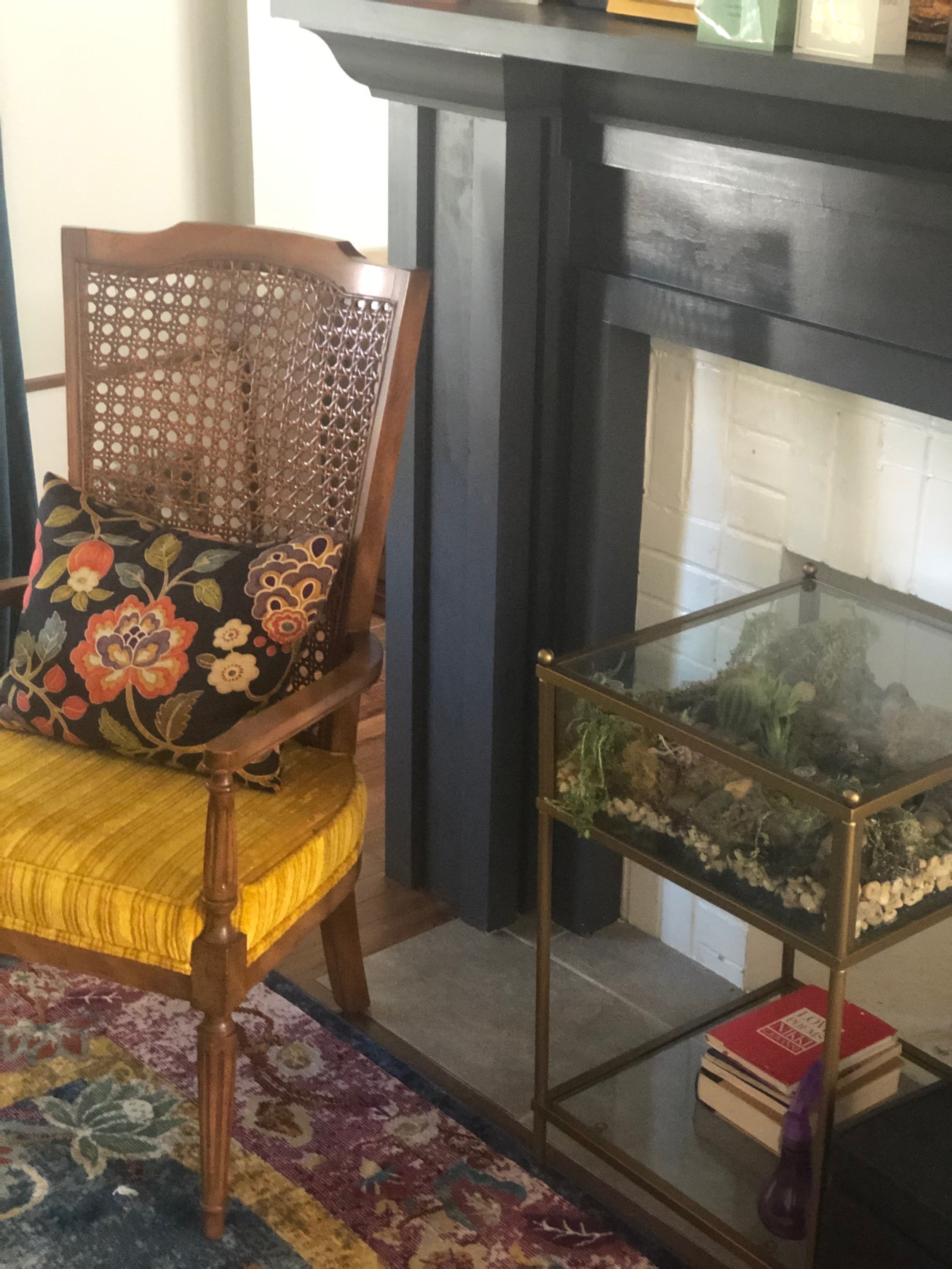
Glass Terrarium Side Table
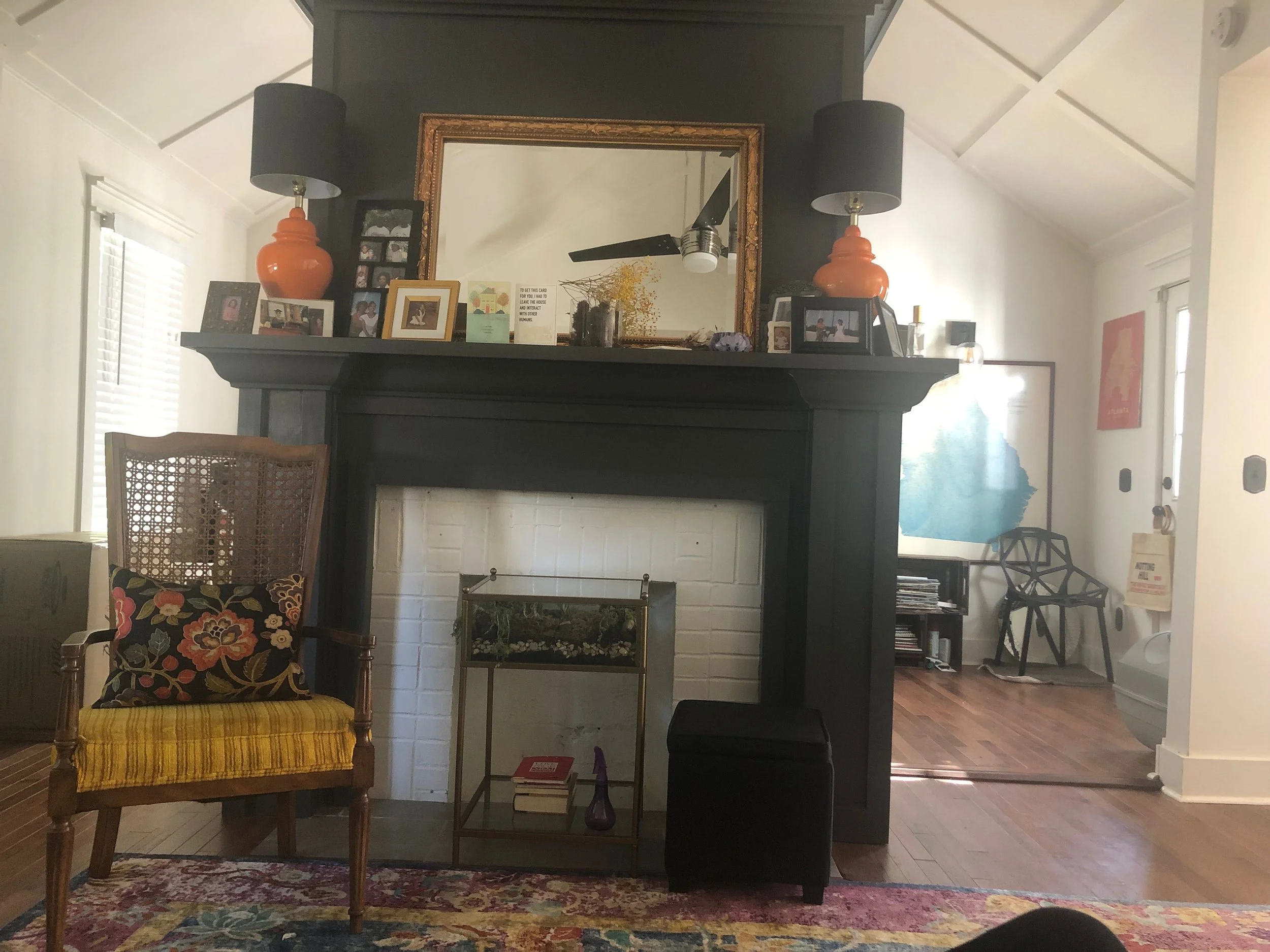
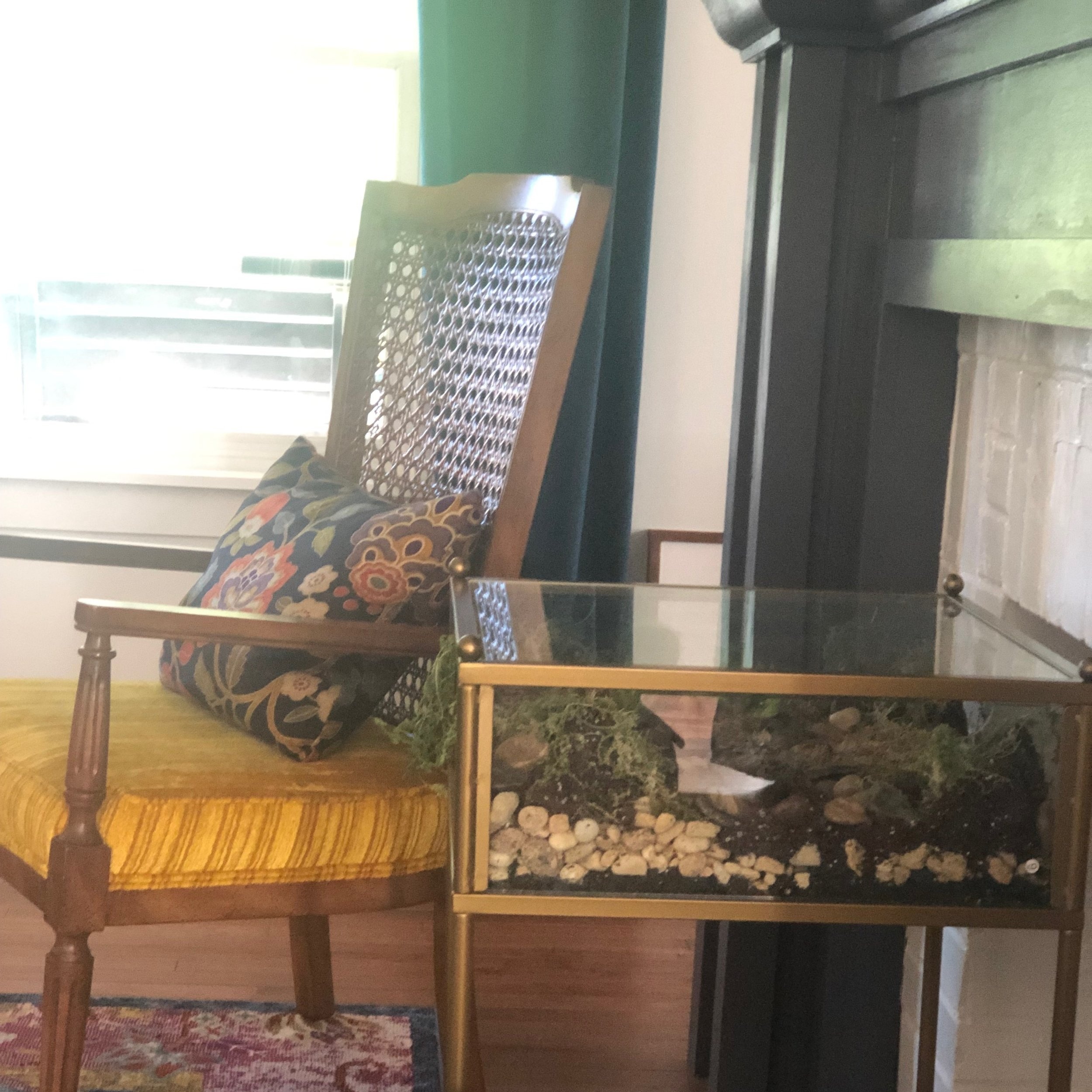
The fireplace feature in my living room (though, I call it the parlor) is really what sold me on my house. It really brings the original house details into the newly renovated look of the house. It’s non-functional, which means I could place things in front of it for a comfy seating area, but I still didn’t want to block this showpiece architectural feature. This glass table fit the bill perfectly, and even allowed me to incorporate some life into the space (though, I can’t guarantee how long these plants will survive with my luck at plant parenting).
Source: Amazon.com
Cane-back Armchair
Another local Goodwill find. I didn’t do anything to this beauty other than take off a piece of upholstery that was covering about 1/3 of the amazingly-intact canework on the back of the chair. The ugly-pretty upholstery was in good condition and worked well with my existing color scheme, so this was an easy win!
Source: Goodwill
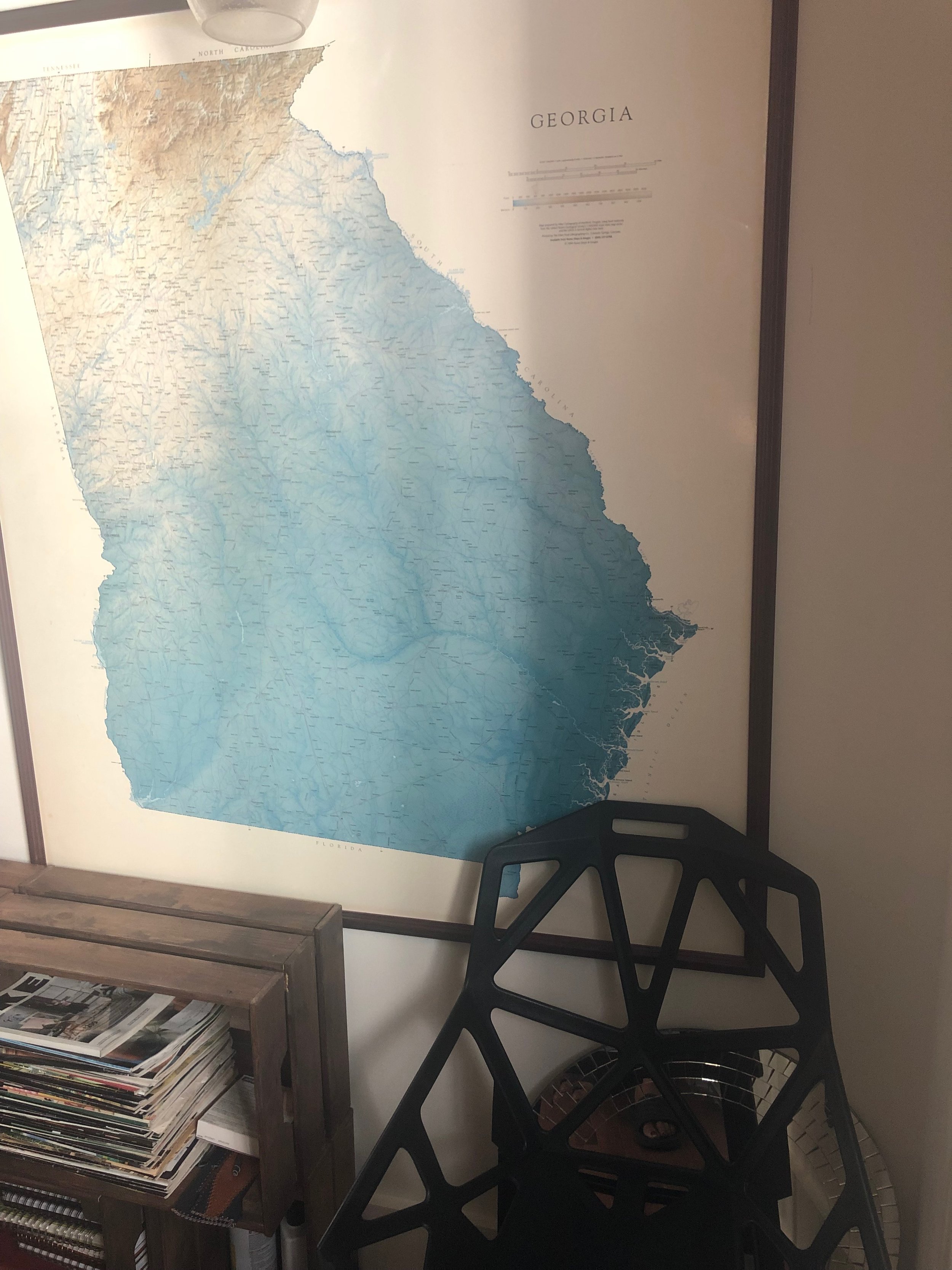
Modern Hollowed-Out Side Chair
This was one of the very first items I bought for the house. For the simple fact that I needed somewhere other than the couch to sit, and these could easily be moved around the house until I got more furniture. The geometric cut-outs allowed me to place them anywhere - like this current-but-not-forever placement in front of my beloved Georgia map - and not worry about whether it was going to block something from view.
Source: Wayfair.com
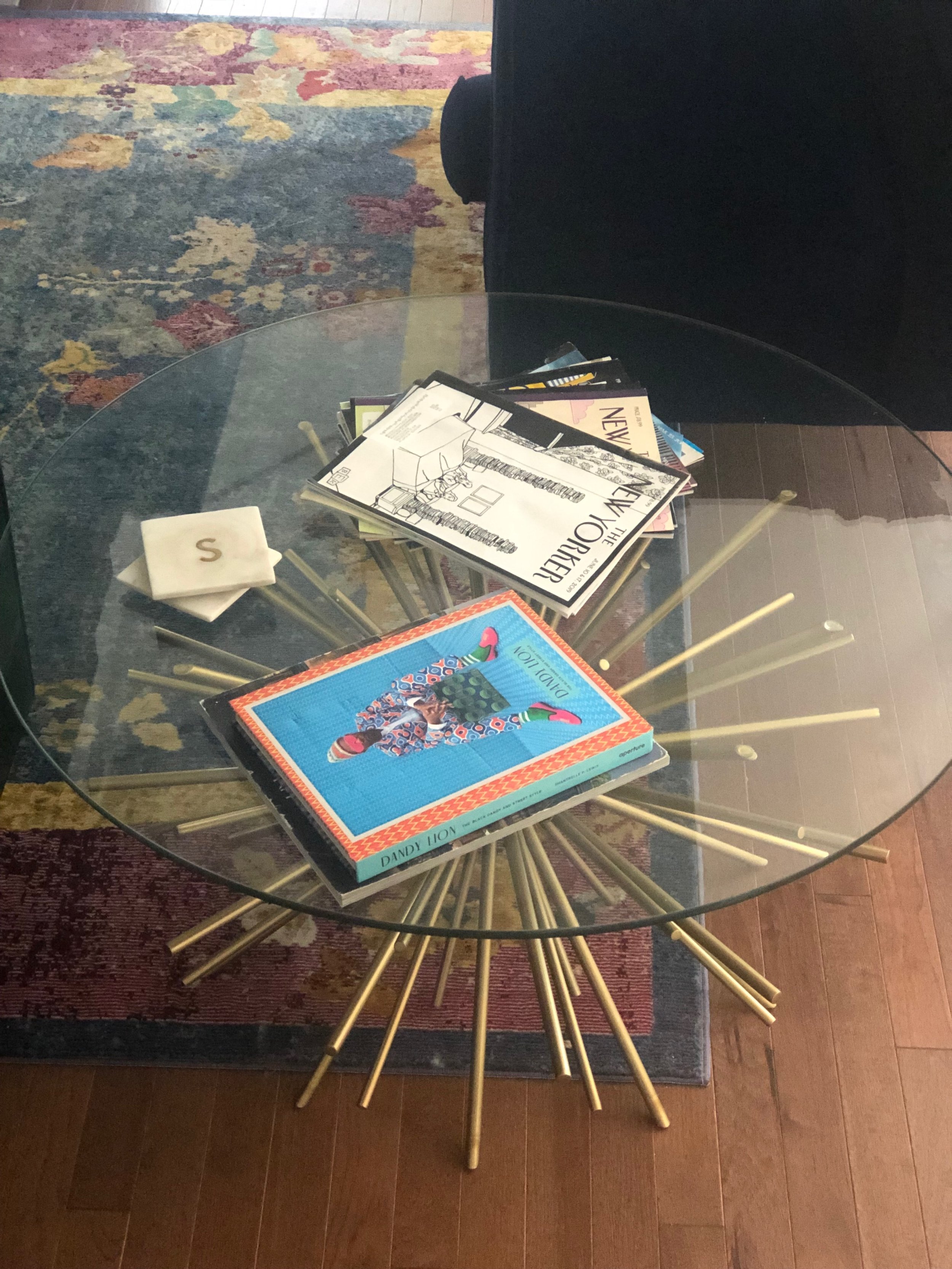
Starburst Coffee Table
Definitely one of my splurge pieces - even though I caught it on sale. This is a statement piece that really helps define the mood and style of my space while still being functional and unobtrusive. A bit more Art-deco meets Hollywood Regency style to give grown-lady glam
Source: West Elm
Kisha Solomon is an Atlanta-based writer, knowledge worker and serial expat. She writes witty, poignant stories about the lessons she’s learned from her life, work and travels. She deals with the sometimes frustrating and often humorous side effects of being black, female and nerdy. When she’s not writing working or travelling, you can find her in deep conversation with herself or her four-legged familiar, Taurus the Cat. www.lifeworktravels.com

